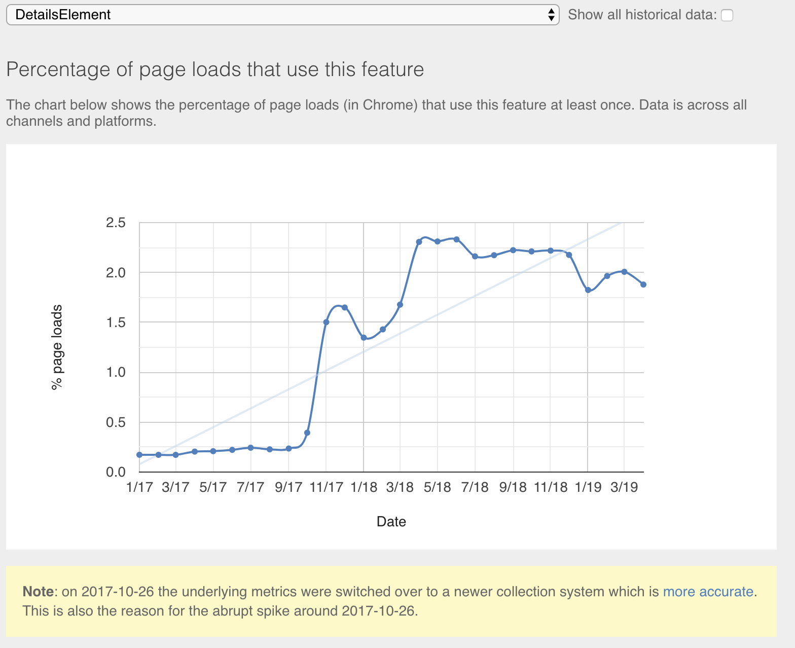
Usage over time
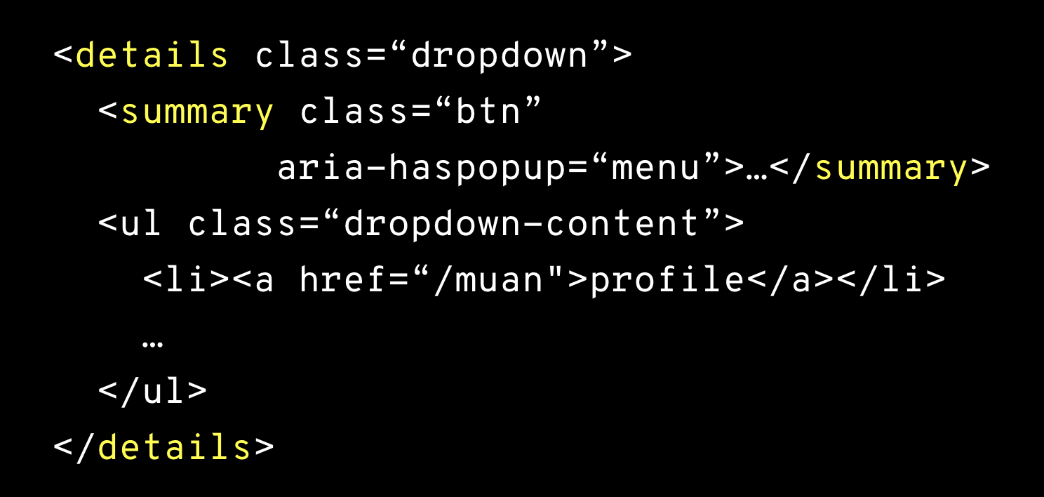
details?It's a pretty useful element that handles showing and hiding content natively!
You wrap a details element around any block of HTML content. The browser will collapse that block of text until a user opens the details block.
If you want the details block open by default, include the open attribute:
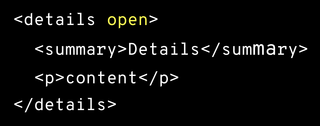
Use the summary as the first child of your details element.
No worries if you don't add a summary. The browser will put the word "Details" in there for you. (After all, users need something to click!)
Style the details element just like any other CSS element.
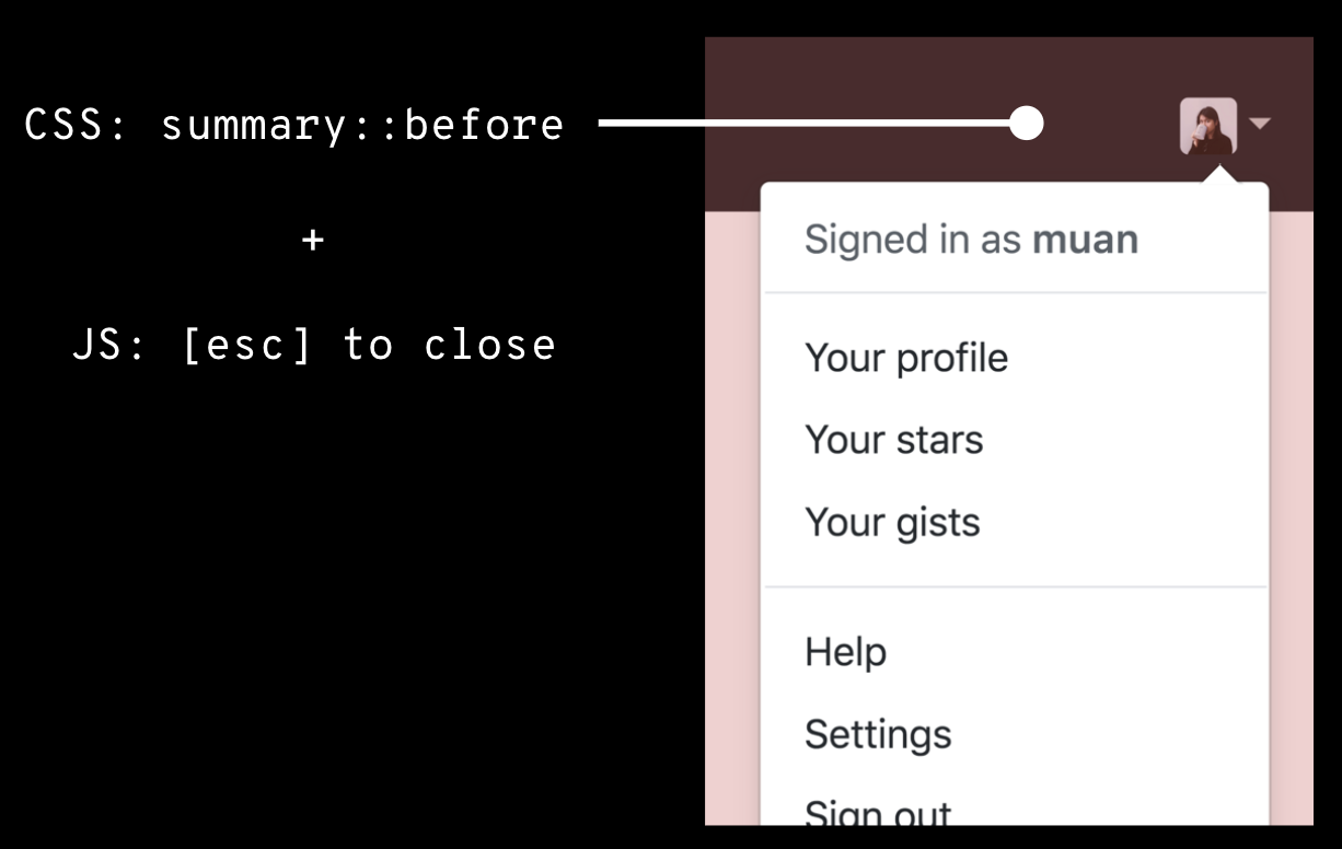
The summary element is where the ▸ marker lives. If you want to get rid of that, there is a prefixed pseudo-element selector ::-webkit-details-marker: set that to display: none for WebKit browsers. In Firefox, set the summary to display: block or flex (anything but the native display: list-item) to get rid of the ▸
Or just use GitHub's CSS helper: reset utility
When a details block is open, it has the open attribute. To style it (or its children) based on its state, use
details[open] { }There's no closed attribute: styles you apply by default will be used on the closed state.
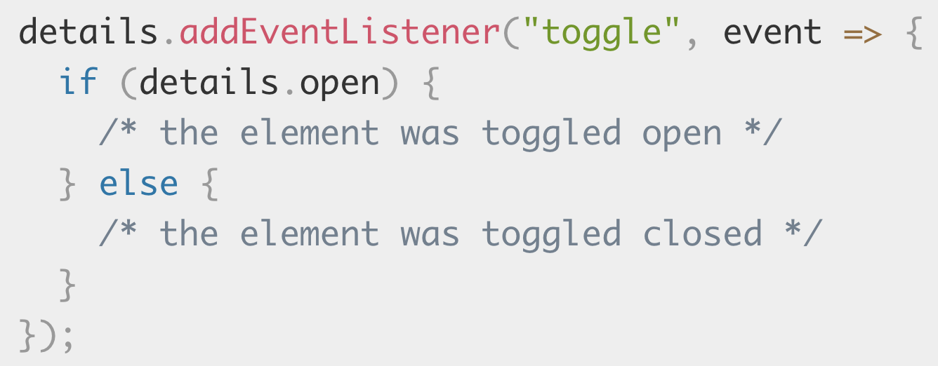
You can listen for the toggle event to detect when the widget changes state:
Since these are native HTML elements, they provide useful semantic information to screen readers out of the box!
Tabable and press enter / space to toggle.
Screen readers will typically read the summary for a collapsed details block (and communicate that it's collapsed). They'll also provide an interactive hook for users to open the details block. If the details is already expanded, they'll read the whole content.
This page!



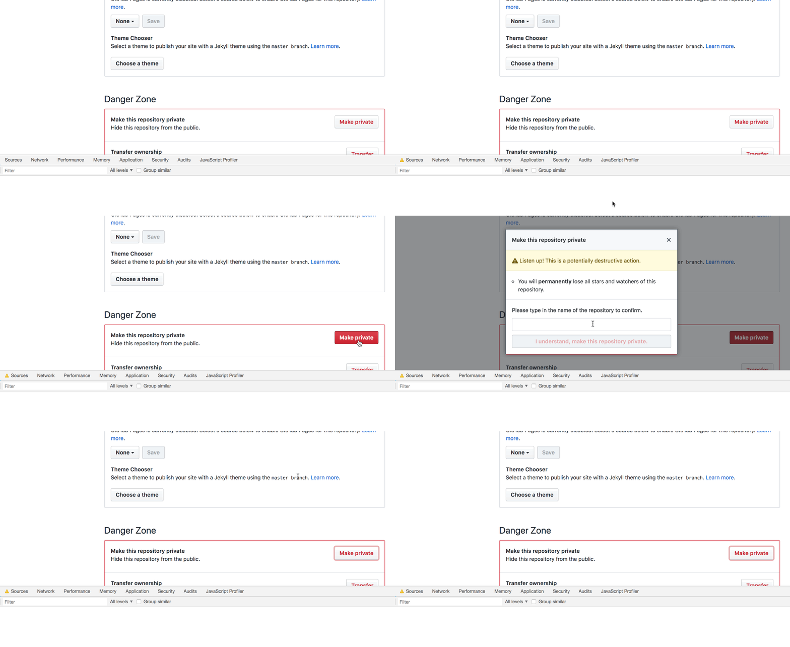
GitHub's <details> dependent Custom Elements:
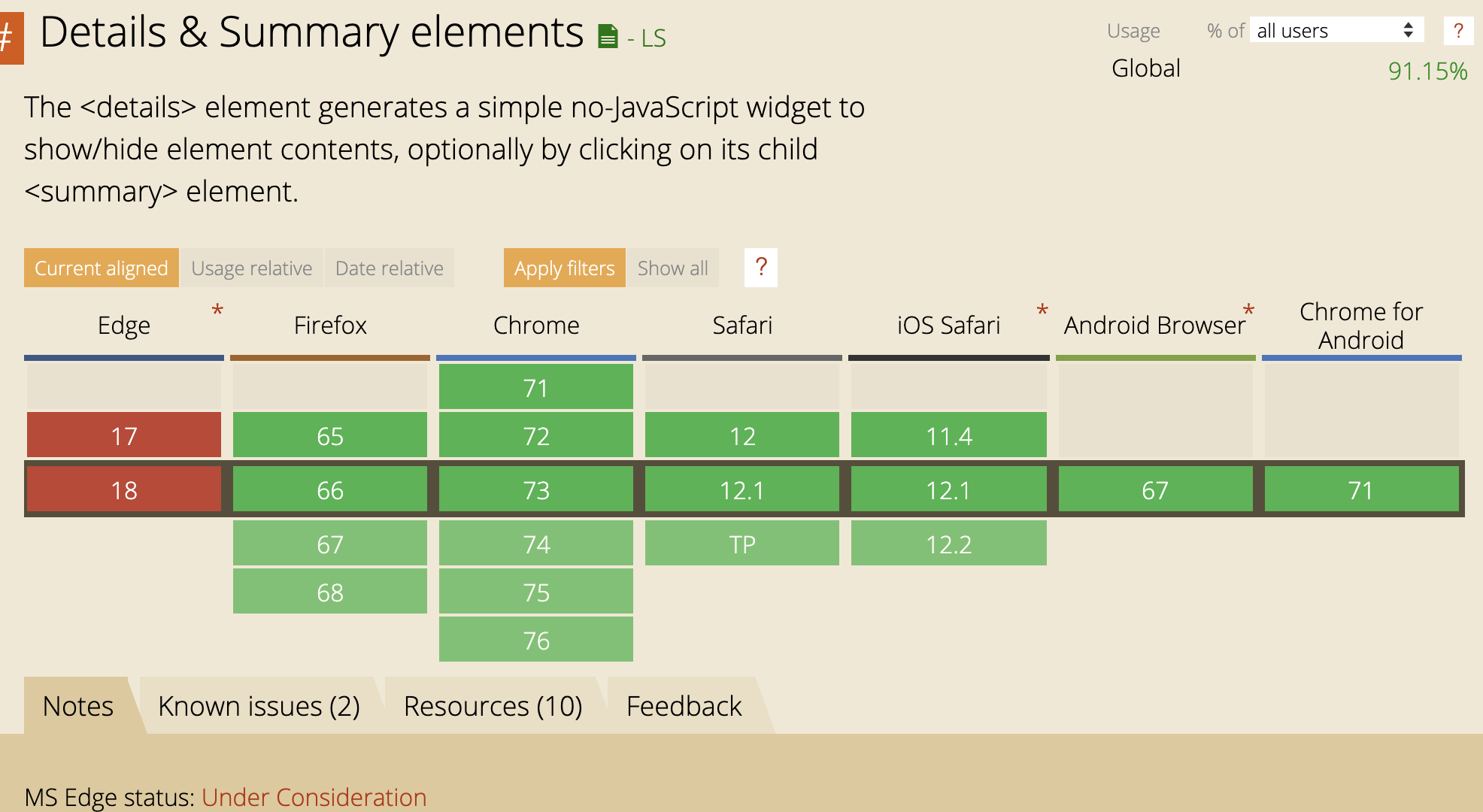
Edge doesn't currently support details/summary with native open/close behavior, but it will be using Chromium soon.
Edge will show all your details elements expanded, so at least the content will still be visible to users.